Everybody creates content. But what makes a stellar content stand out from the rest?
The answer is simple. It’s visual design.
And to have an eye-catching visual design, it is important to follow a visual hierarchy.
Visual hierarchy is a powerful design concept that helps organize and present content in a way humans can easily understand.
In this comprehensive guide, we’ll delve into the best practices and real-life examples of visual hierarchy in action, equipping you with the knowledge to transform your content into a captivating, user-friendly masterpiece.
Are you ready to elevate your content design game? Let’s get started!
Understanding Visual Hierarchy in Content Design
Visual hierarchy is a fundamental concept in the realm of design. It refers to the arrangement of design elements in such a way that the most important information is easily perceived by the viewer.
A well-thought-out visual hierarchy helps guide the reader’s eye through a layout, ensuring that they grasp the essential elements and understand the intended message.
The concept of visual hierarchy is rooted in the natural way our eyes and brain process visual information. We instinctively prioritize certain elements based on their size, color, contrast, alignment, and other factors.
By leveraging these innate tendencies, graphic designers can create compelling layouts that effectively communicate their intended message. Whether you’re working on a website, an infographic, a poster, or any other type of content, understanding and implementing visual hierarchy is crucial to your success.
Visual hierarchy is not just limited to the world of graphic design. It plays a vital role in web design, user interface (UI) design, and even content creation.
With the ever-growing amount of information available on the internet, it’s more important than ever to create a clear and concise visual hierarchy that guides readers through your content and helps them quickly find the information they’re looking for.
The Importance of Visual Hierarchy in Content Design

Visual hierarchy in content design is crucial for several reasons. First and foremost, it enables users to easily navigate through a website or digital product. By emphasizing the most important elements and creating a clear path for users to follow, visual hierarchy helps to improve usability and user experience.
A well-designed visual hierarchy also helps to communicate your message more effectively. By organizing content in a logical order and drawing attention to key points, you can guide users through your content and make it easier for them to understand and retain the information you’re presenting.
In addition, a strong visual hierarchy can help to establish your brand identity and create a cohesive visual language across all your marketing materials. By using consistent design elements and principles, you can create a recognizable and memorable brand that stands out in the minds of your audience.
Principles of Visual Hierarchy
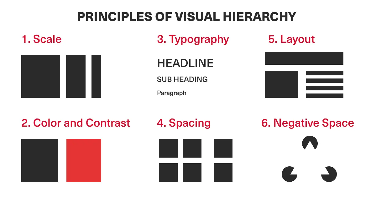
There are several core principles of visual hierarchy that can help guide your design decisions. These include:
- Size and scale: Larger elements naturally draw more attention and are perceived as more important than smaller ones. By playing with size and scale, you can create a clear hierarchy that highlights the most important aspects of your content.
- Contrast and color: Using contrasting colors and shades can help to create a sense of depth and dimension, making certain elements stand out more than others. This can be particularly effective when combined with other principles, such as size and scale.
- Typography and text: The choice of font, size, and style can greatly impact the visual hierarchy of your content. Bold and large fonts will naturally draw more attention, while smaller and lighter fonts can be used for less important information.
- Layout and composition: The way elements are arranged on a page can greatly influence the overall visual hierarchy. By using grids, alignment, and proximity, you can create a layout that is both visually appealing and easy to navigate.
- Whitespace: Also known as negative space, whitespace can be used to create a visual separation between elements and improve the overall readability of your content. By strategically incorporating whitespace into your design, you can create a more balanced and harmonious visual hierarchy.
Layout Design and its Role in Visual Hierarchy
Layout design plays a crucial role in establishing a strong visual hierarchy. A well-designed layout not only looks visually appealing but also helps users easily navigate through your content.
Here are some key aspects of layout design that can greatly impact visual hierarchy:
Grid systems: Using a grid system can help you create a more organized and structured layout, guiding the placement and arrangement of elements on the page. Grids can be used to create a sense of consistency and balance, making your content more visually appealing and easier to navigate.
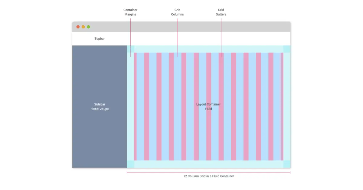
Alignment: Aligning elements on the page can help to create a sense of unity and cohesion, establishing a clear visual hierarchy. By aligning elements along a common axis or edge, you can create a more organized and professional-looking layout.
Proximity: The principle of proximity states that elements that are related to each other should be placed close together, while unrelated elements should be separated. This can help to create a clear visual hierarchy by grouping related content and making it easier for users to identify and understand the relationships between different elements.
Visual flow: Creating a clear visual flow is essential for guiding users through your content. By arranging elements in a logical order and using visual cues, such as arrows or lines, you can help users quickly and easily follow the flow of information and navigate through your content.
Best Practices for Creating a Strong Visual Hierarchy
To create a compelling visual hierarchy in your content design, consider the following best practices:
- Start with a clear goal: Before you begin designing, it’s important to have a clear understanding of the message you want to communicate and the goals you want to achieve with your content. This will help guide your design decisions and ensure that your visual hierarchy supports your overall objectives.
- Prioritize content: Determine the most important elements of your content and prioritize them in your visual hierarchy. This might include headings, key points, or call-to-action (CTA) buttons. By emphasizing these elements, you can guide users through your content and help them quickly find the information they’re looking for.
- Be consistent: Consistency is key when it comes to establishing a strong visual hierarchy. Use consistent fonts, colors, and design elements across all your content to create a cohesive visual language that is easily recognizable and memorable.
- Keep it simple: Avoid clutter and unnecessary distractions by keeping your design clean and simple. Use whitespace and visual separation to create a balanced layout that is easy to navigate and understand.
- Test and iterate: As with any design process, it’s important to test your visual hierarchy and gather feedback from users. This can help you identify any areas that need improvement and ensure that your visual hierarchy is effectively guiding users through your content.
Visual Hierarchy in Typography

Image Source: Nuts About Typography on Dribbble
Typography plays a crucial role in establishing a strong visual hierarchy. The choice of font, size, and style can greatly impact how users perceive and process the information you’re presenting.
Here are some tips for using typography to enhance your visual hierarchy:
- Choose the right font: Select a font that is easy to read and aligns with the tone and style of your content. Consider using different fonts for headings, subheadings, and body text to create a clear hierarchy and make it easier for users to scan and read your content.
- Use size and weight to create emphasis: Play with font size and weight to draw attention to key points and create a clear hierarchy. Larger, bolder fonts will naturally draw more attention and can be used for headings and important information, while smaller, lighter fonts can be used for supporting text and details.
- Incorporate hierarchy within the text: Use headings, subheadings, and bullet points to break up large blocks of text and create a clear hierarchy within your content. This can make it easier for users to scan and read your content and quickly find the information they’re looking for.
- Use contrast and color: Use contrasting colors and shades to create emphasis and depth in your typography. This can help to draw attention to key points and create a more dynamic and engaging visual hierarchy.
Utilizing Color and Contrast in Visual hierarchy
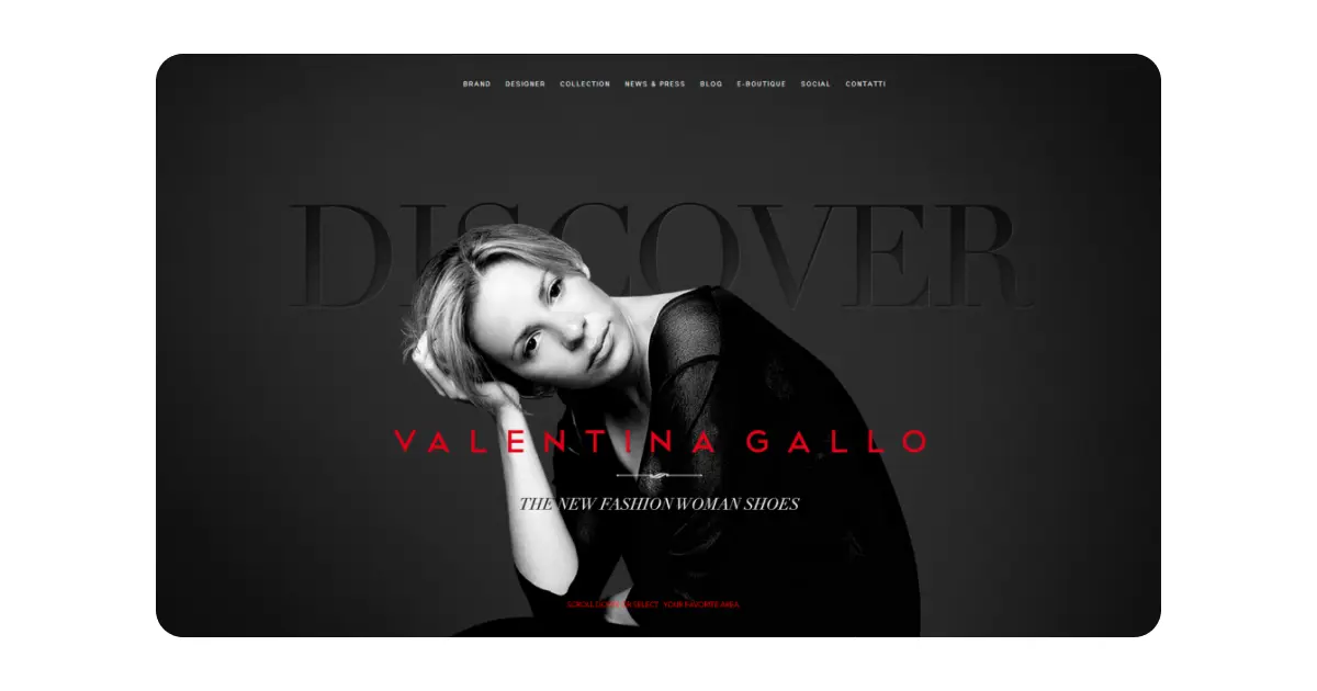
Image Source: CSS Design Awards
Color and contrast are powerful tools for creating a strong visual hierarchy. Using contrasting colors and shades, you can create depth and dimension, making certain elements stand out more than others.
Here are some tips for using color and contrast to enhance your visual hierarchy:
- Choose a color palette: Start by selecting a color palette that complements your brand and content. This might include a primary color, secondary colors, and accent colors that can be used throughout your design.
- Use contrast to create emphasis: Use contrasting colors to draw attention to key points and create a clear hierarchy. For example, you might use a dark background with light text for headings, or use bold, bright colors for CTA buttons.
- Consider color psychology: Different colors can evoke different emotions and associations, so it’s important to consider the psychological impact of your color choices. Choose colors that align with the tone and message of your content, and consider how they might influence users’ perceptions and reactions.
- Ensure accessibility: When using color and contrast, it’s important to ensure that your design is accessible to all users, including those with color vision deficiencies or other visual impairments. Use tools like Color Safe or the WebAIM Contrast Checker to ensure that your color combinations meet accessibility guidelines.
Incorporating White Space for Better Visual Hierarchy
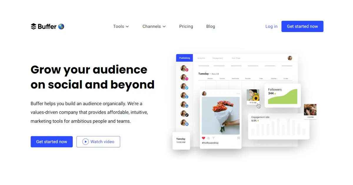
Image Source: Buffer
Whitespace, also known as negative space, is an important element of visual hierarchy.
By incorporating whitespace into your design, you can create a visual separation between elements, improve readability, and create a more balanced and harmonious layout. Here are some tips for using whitespace to enhance your visual hierarchy:
- Use whitespace to group and separate elements: Use whitespace to create visual separation between different elements and groups of content. This can help to create a clear hierarchy and make it easier for users to identify and understand the relationships between different elements.
- Balance whitespace with content: While whitespace can help to create a clean, uncluttered layout, it’s important to strike a balance between whitespace and content. Ensure that your design is not too sparse or too crowded, and use whitespace strategically to guide users through your content.
- Consider the impact of whitespace on readability: Whitespace can greatly impact the readability of your content, particularly when it comes to typography. Use whitespace to create a visual separation between lines and paragraphs, making it easier for users.
Inspiring Examples of Visual Hierarchy in Content Design
Every design project has its unique requirements, and it’s up to you to determine the most effective way to present your content.
With that in mind, let’s delve into some inspiring examples that showcase the power of visual hierarchy in content design.
1. Apple’s Homepage

Image Source: Apple
One of the most recognizable examples of visual hierarchy in content design is Apple’s homepage. Their minimalist approach and clean layout allow users to focus on the most important elements – the products.
Apple’s designers use a combination of size, color, and contrast to create a clear hierarchy that guides the viewer’s eye to where it needs to go.
The large, bold product images grab attention, while the smaller, less prominent text provides supplementary information. By using visual hierarchy effectively, Apple’s homepage is both visually appealing and highly functional.
2. National Geographic’s Infographics

Image Source: National Geographic
National Geographic is known for its stunning visuals and engaging storytelling. These graphics use visual hierarchy to present complex information in a digestible, easy-to-follow format.
By using a combination of size, color, and typography, National Geographic guides the reader’s eye through the infographic, ensuring that they grasp the key points and understand the overall message.
This approach makes their infographics not only visually stunning but also highly informative and educational.
3. Airbnb’s Search Results Page
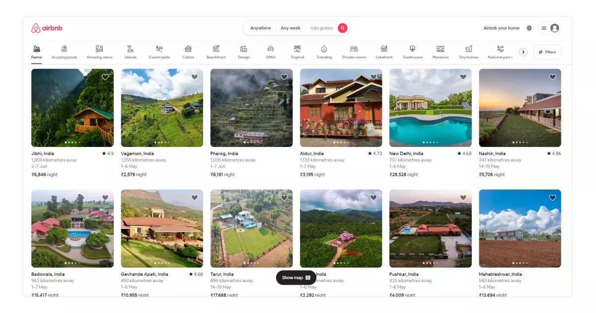
Image Source: Airbnb
Airbnb’s search results page showcases another excellent example of visual hierarchy in content design. When users search for accommodations, they’re presented with a clean, well-organized layout that prioritizes the most important information.
The property images are large and eye-catching, drawing the user’s attention and helping them quickly identify potential options. Meanwhile, the text elements, such as the property name, price, and rating, are arranged in a clear hierarchy that’s easy to scan and digest.
By employing visual hierarchy effectively, Airbnb ensures that its users can quickly and easily find the ideal accommodations for their needs.
Tools and Resources for Mastering Visual Hierarchy
Now that we’ve seen some inspiring examples, let’s explore some tools and resources that can help you master visual hierarchy in your content design projects.
Tool 1: Adobe Creative Cloud
Adobe Creative Cloud is a comprehensive suite of design tools that includes industry-standard applications like Photoshop, Illustrator, and InDesign. These programs provide a wealth of features and capabilities that can help you create stunning visual hierarchies in your content design projects.
From advanced typography controls to powerful image editing capabilities, Adobe Creative Cloud gives you the tools you need to craft effective and engaging layouts.
Tool 2: Canva
Canva is an online design platform that provides a wide array of templates and tools for creating professional-looking content. With its easy-to-use interface and extensive library of design elements, Canva is an excellent resource for mastering visual hierarchy.
The platform offers numerous templates that incorporate effective visual hierarchies, providing a solid starting point for your own projects.
Additionally, Canva’s intuitive drag-and-drop interface allows you to easily experiment with different layouts and arrangements, helping you hone your skills and develop an eye for effective visual hierarchy.
Resource 1: Awwwards
Awwwards is a website that showcases the best web designs from around the world, providing a wealth of inspiration for your own projects.
By browsing through the site, you can gain valuable insights into how top designers use visual hierarchy to create compelling and effective content.
Awwwards also offers a blog and learning platform, where you can find articles, tutorials, and other resources to help you expand your knowledge of visual hierarchy and other design principles.
Resource 2: Books and Online Courses
There are plenty of books and online courses available that can help you dive deeper into the world of visual hierarchy and content design. Some recommended titles include
Don’t Make Me Think by Steve Krug
The Design of Everyday Things by Don Norman
Seductive Interaction Design by Stephen Anderson
Online platforms like Coursera, Skillshare, and Udemy also offer a wealth of courses on design principles, including visual hierarchy.
Final Thoughts
In conclusion, mastering visual hierarchy in content design is a critical skill that can make a significant difference in the effectiveness of your message.
By understanding the principles of visual hierarchy and implementing them in your projects, you can create compelling, engaging layouts that guide the viewer’s eye and convey your intended message.
Take the time to study inspiring examples, experiment with different tools and resources, and continually refine your skills. As you grow more confident in your ability to create effective visual hierarchies, you’ll find that your content design projects become more successful and impactful.
Remember that mastering visual hierarchy is an ongoing process, and there’s always room for improvement. Keep learning, experimenting, and evolving, and you’ll continue to elevate your content design to new heights.